the boba! edit credit spread(it)
select an image to be taken to layout
foreword
the main inspiration for this collection were various sources of UI design (user-interface design - the practise of designing web and mobile interfaces to create a fun and easy experience for the user) found from all over the interwebs. while design is constantly changing, evolving, with new ideas being introduced everyday, i found in my research that the current trend revolves around solid colours or gradients paired with rounded edges(bubbles, if you will), which i think is quite a playful take on modern design! it's a bit different to what i usually do with my magazine style layouts but i've decided that i want to explore different design styles through the release of a 'name edit' each time. i enjoy the magazine aesthetic but i'm not entirely sure it'll go anywhere in the long term. eventually i'll find something i like and that may be going back to my original design aesthetic but for now, i'm gonna experiment and have with bubbles and colour! :)
this will be the new format that i release my collections in. while the designs may vary thematically per 'edit', i will continue this trend of producing 5-6 profiles at a time paired with 1-2 roleplay packs. all one off profiles will archived sometime in the near future to keep the side bar clean.
peachy keen - p
layout inspiration: n/a
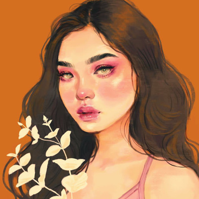
art credit: salgoo (*)
priory - p
layout inspiration: click
art credit: cheracy
matilda - p
layout inspiration: n/a
art credit: janice sung
flovie - p
layout inspiration: click
art credit: leila menendez
oroton - p
layout inspiration: click
art credit: 0073.uv
dublin jack - p
layout inspiration: n/a
art credit: toian med
st. lavender - r
layout inspiration: click
art credit: 0073.uv
( other )
gradient technique used in matilda — ux5, i believe, was the first to use this technique(it honestly blew my mind when i first saw it oh my god) so the idea credit goes entirely to them!
overflow usage on images to keep their dimensions proportionate used in various — disrespect used this in golden fleece for the room layouts and, again, my mind was blown because i had no clue you could do that. it's my new favourite thing dfghj thank you senpai for letting me learn from your code!
( * - i'm not 100% certain that the artist used in peachy keen is correct since the icon pack wasn't labelled in the description. however there was a tag with the name 'salgoo icons' so i think i can safely assume that that is the artist. )


